Maire Floral Design
A luxury brand identity built for a high end wedding florist, refined, romantic, and intentional. Every visual decision made to reflect the artistry behind each arrangement.
Industry
Luxury Wedding Floristry
role
Brand Designer
scope
Brand · Web · Print
the brief
Refined, romantic, intentional.
Maire Floral Design needed a brand that matched the quality and artistry of her work. The existing visual presence didn't reflect a luxury wedding market, it blended in rather than standing out. The goal was to build something timeless that would attract the right clients and communicate premium positioning from the first impression.
the challenge
A talented florist with no visual identity to match her calibre of work. The brand needed to feel luxury without feeling cold, romantic without feeling generic.
The approach
Soft blush tones, refined script typography, and delicate illustrative elements, designed to let the florals be the hero while the brand provides an elevated frame.
Brand Identity
A palette that lets the florals breathe.
The colour palette was built to feel warm and romantic without overpowering the product. Soft blush tones paired with deep neutrals create contrast while keeping the focus where it belongs, on the arrangements themselves.
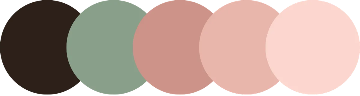
Brand palette and visual identity system
soft blush
#FBD5CE
rose blush
#E8B5AB
deep blush
#CB9287
sage
#8A9E8A
bark
#2B2018
Typography
Elegance with clarity.
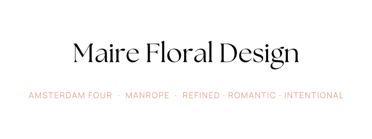
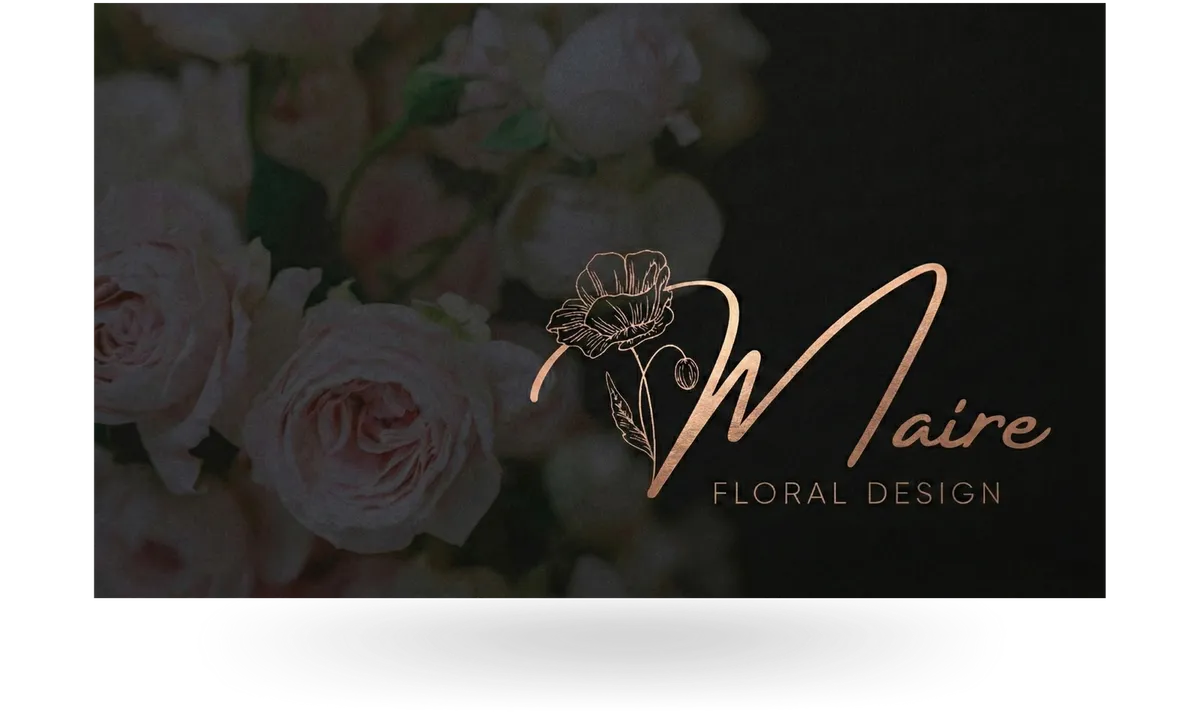
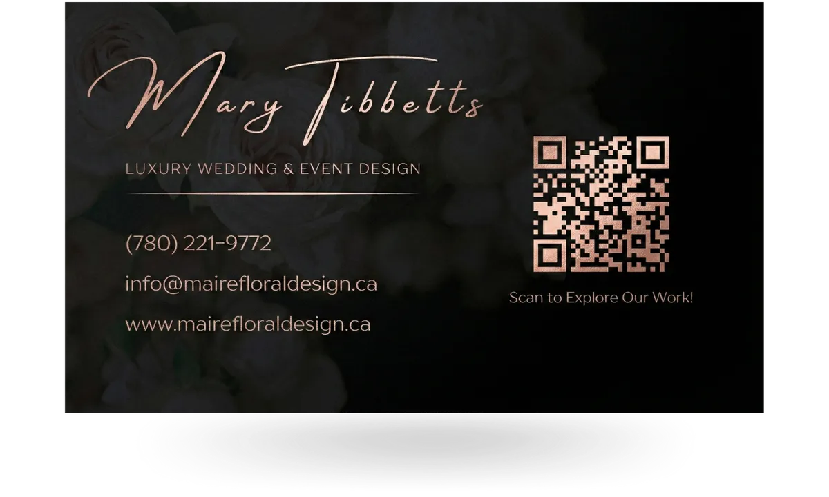
Typography was chosen to balance personality with readability. A refined serif script carries the brand's romantic character across headlines and logos, while a clean supporting sans-serif ensures everything stays legible across both digital and print materials.
web design
The brand, extended online.
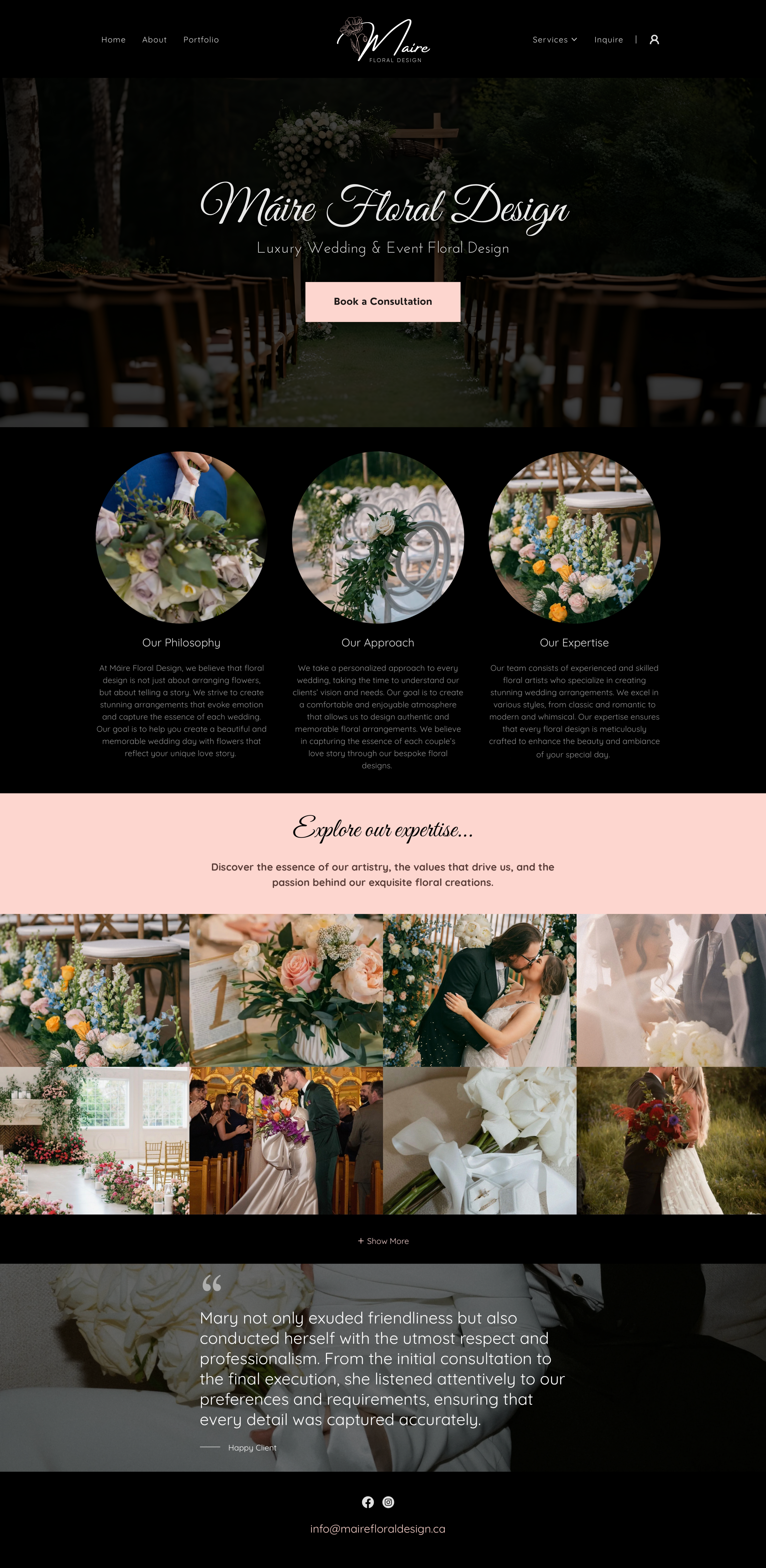
The website extends the identity seamlessly into the digital space. Large imagery, soft overlays, and restrained motion guide visitors through the work without distraction. The result is a site that feels immersive, polished, and aligned with the in person experience clients can expect.
Brand Applications
Built to live everywhere.
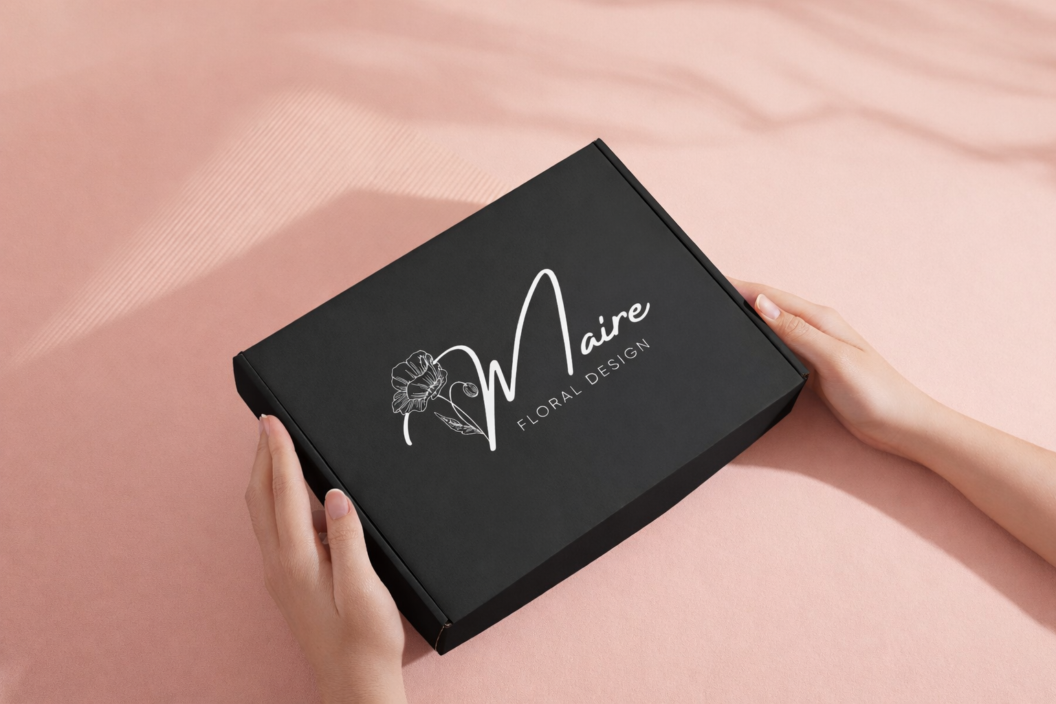
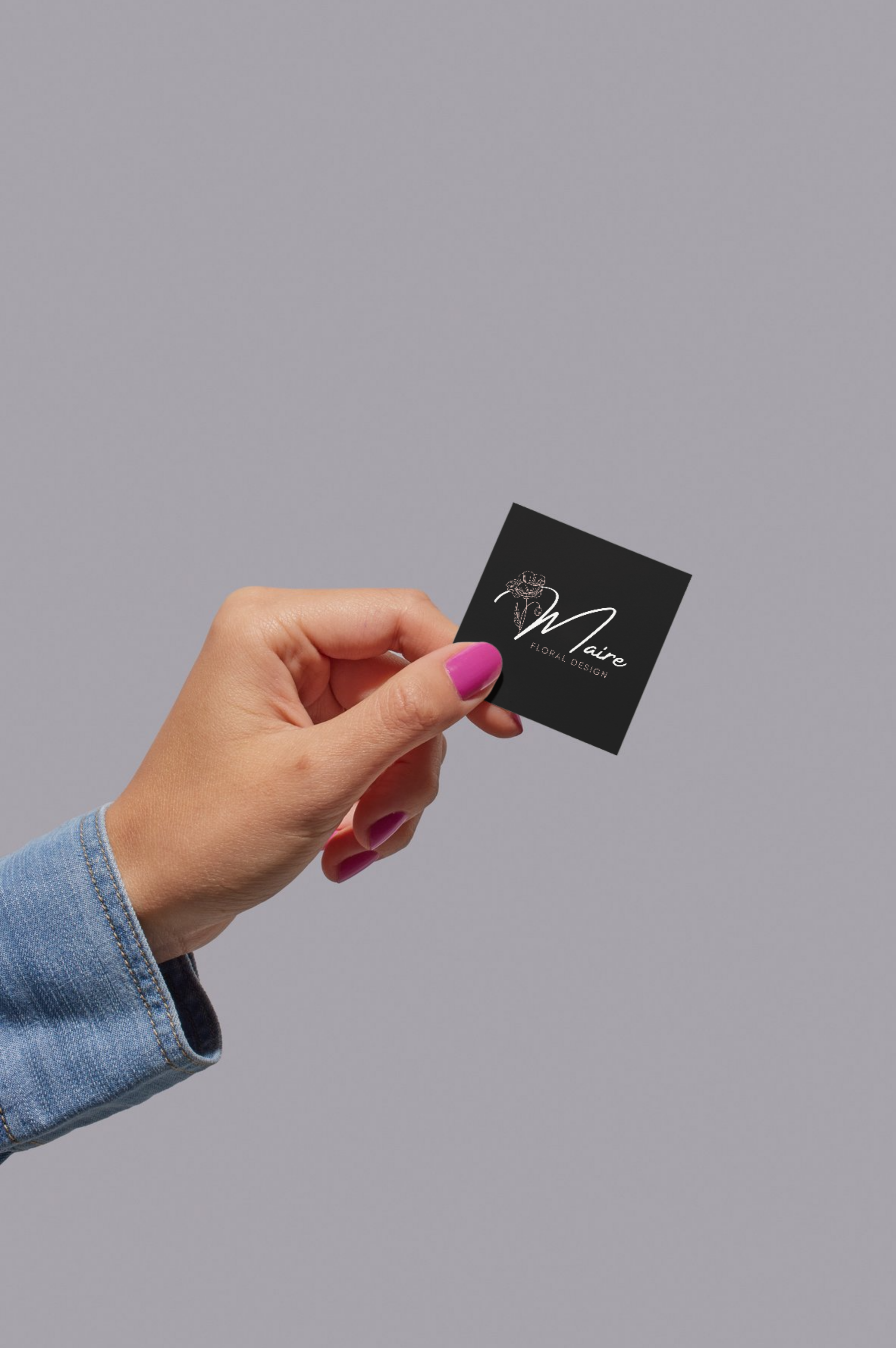
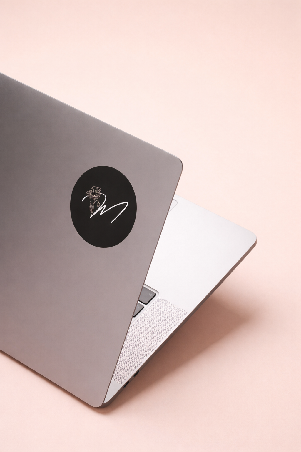
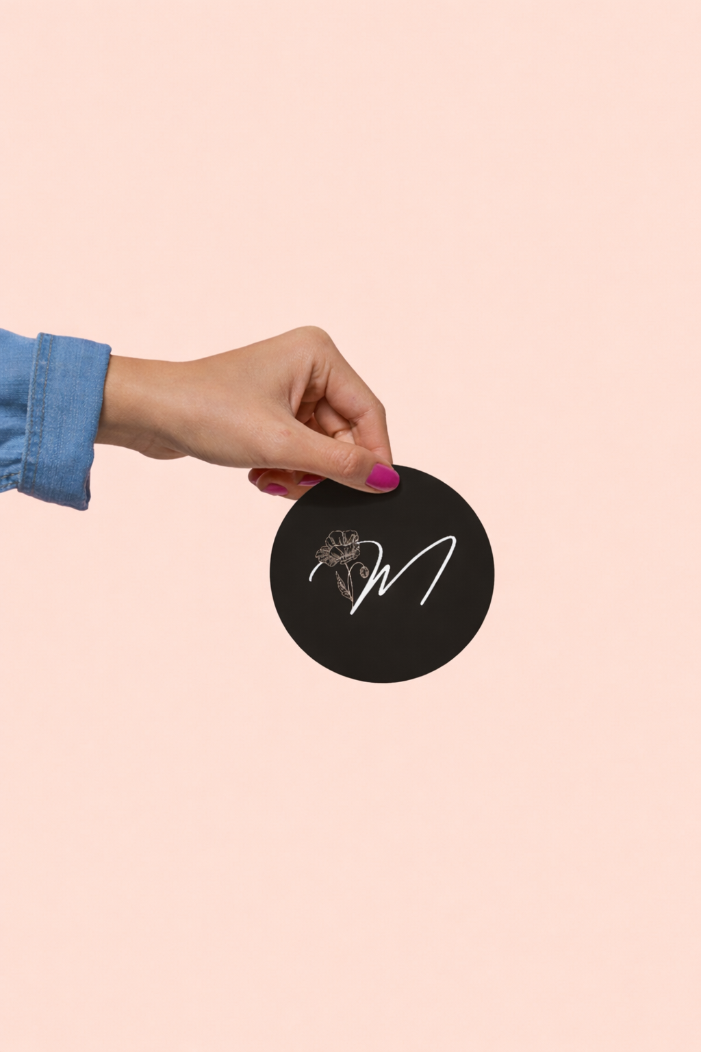
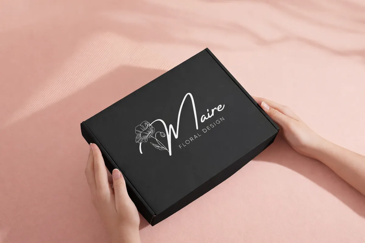
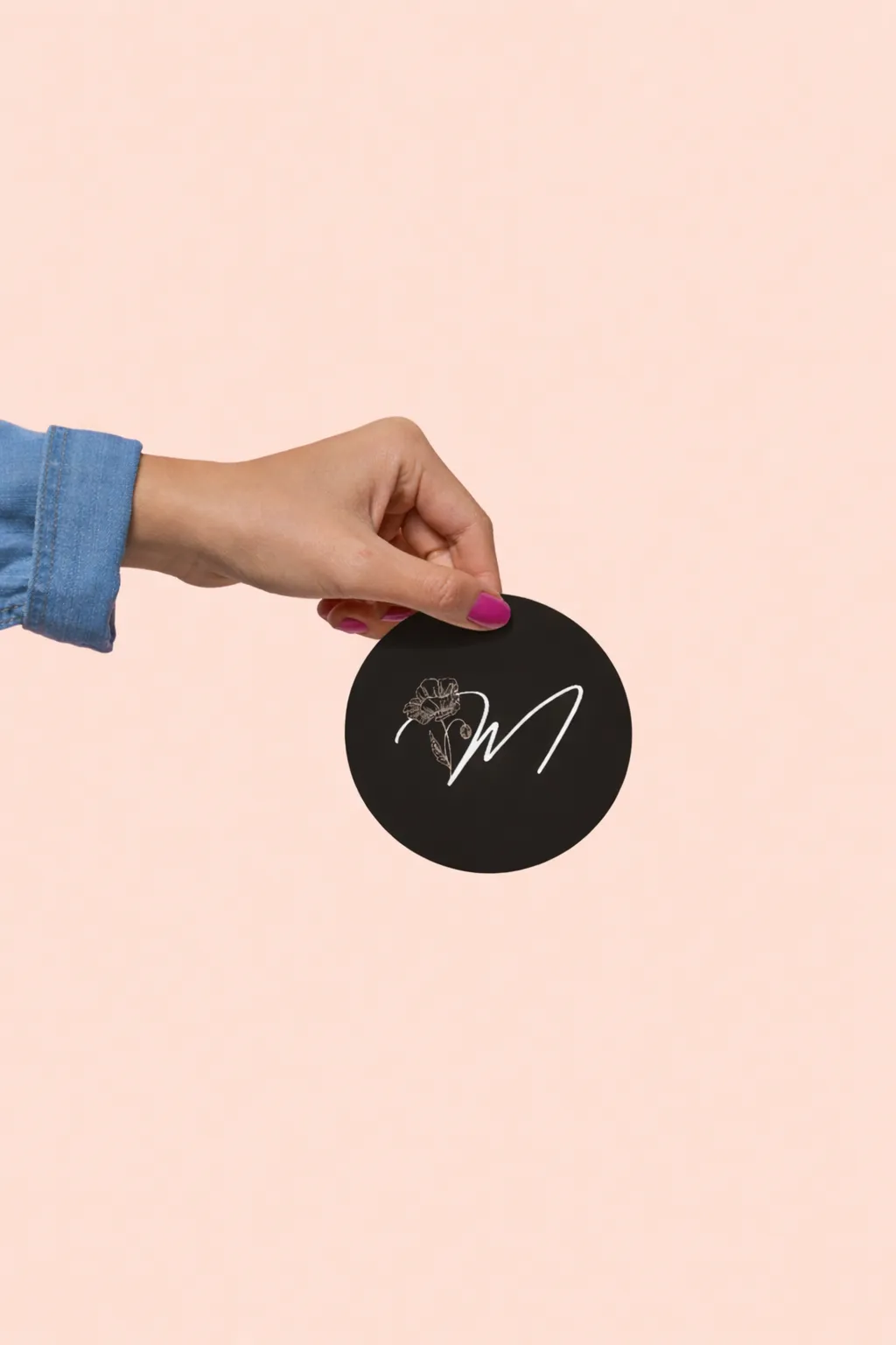
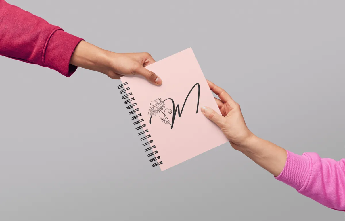
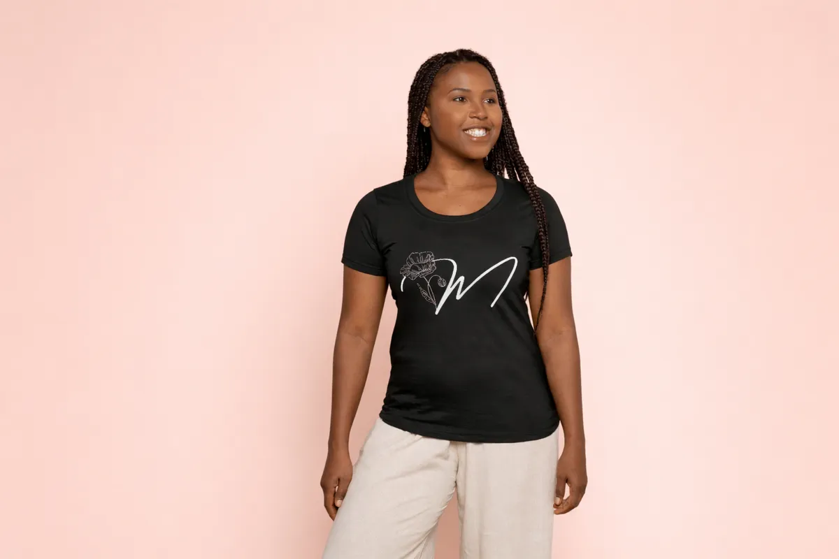
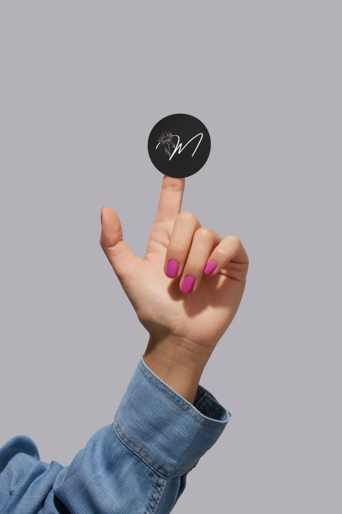
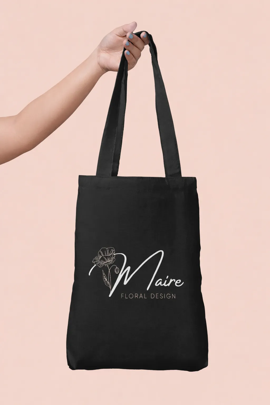
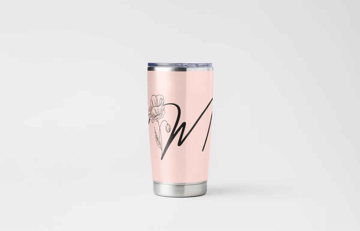
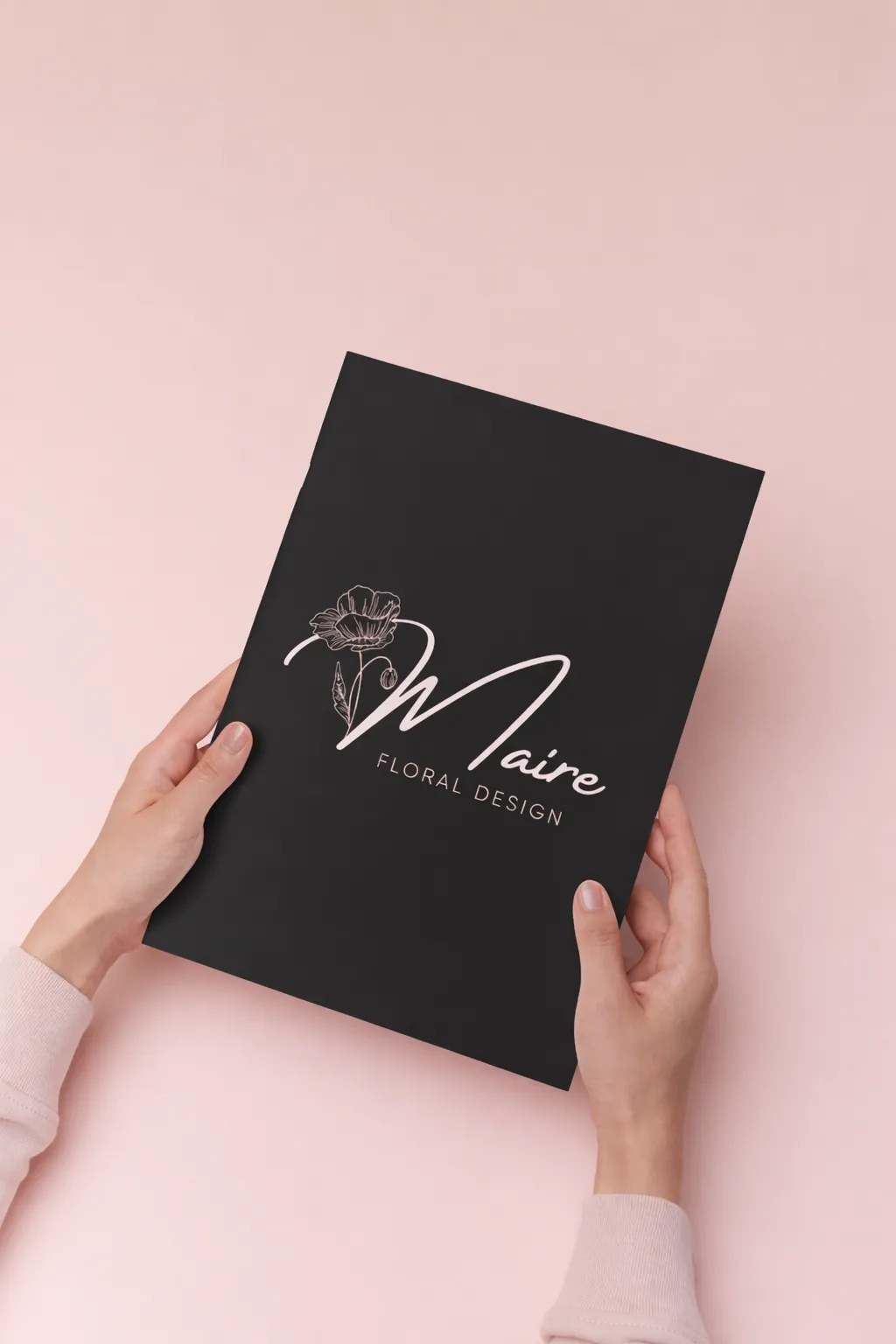
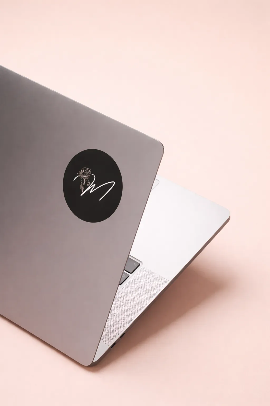
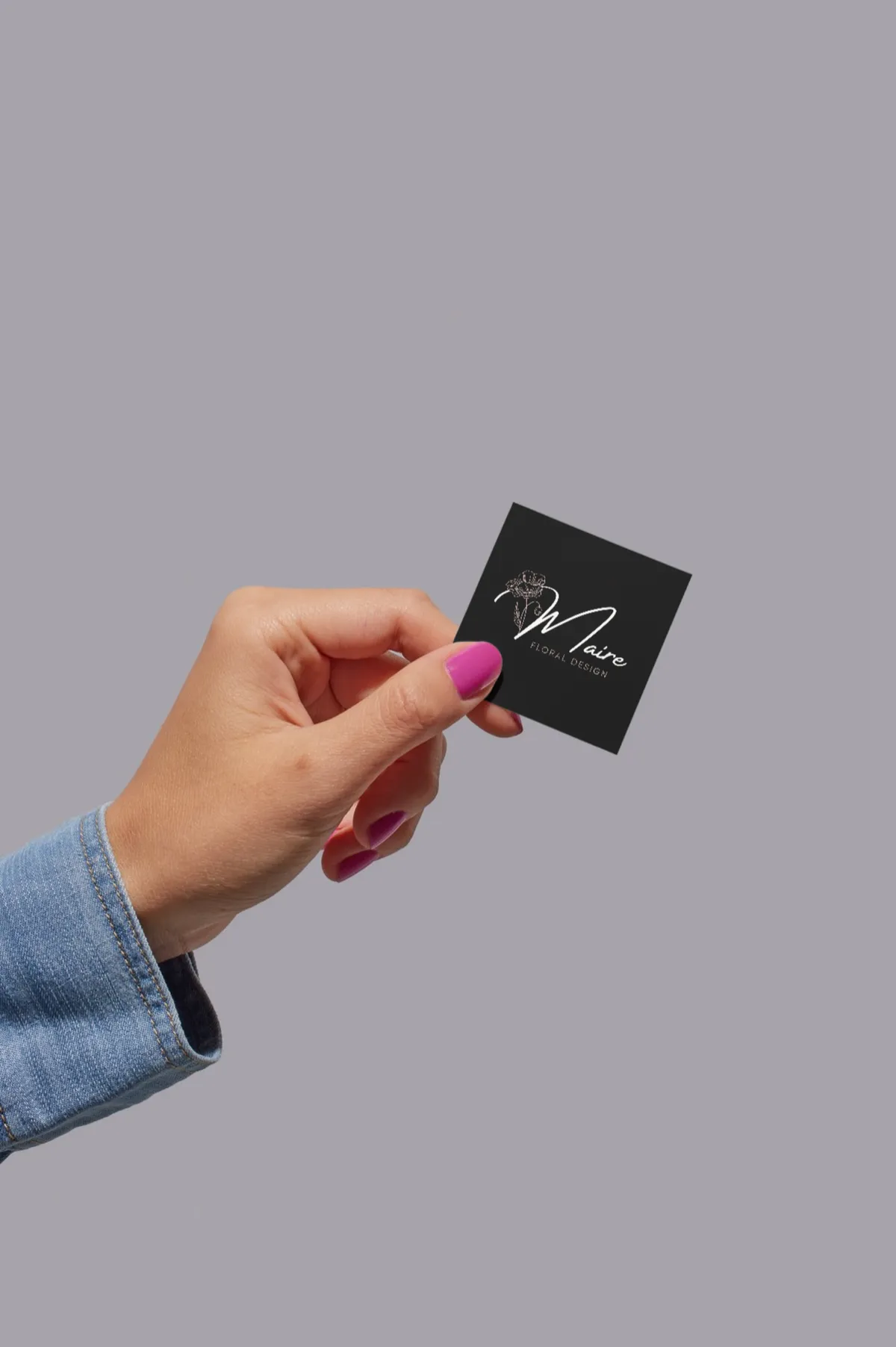
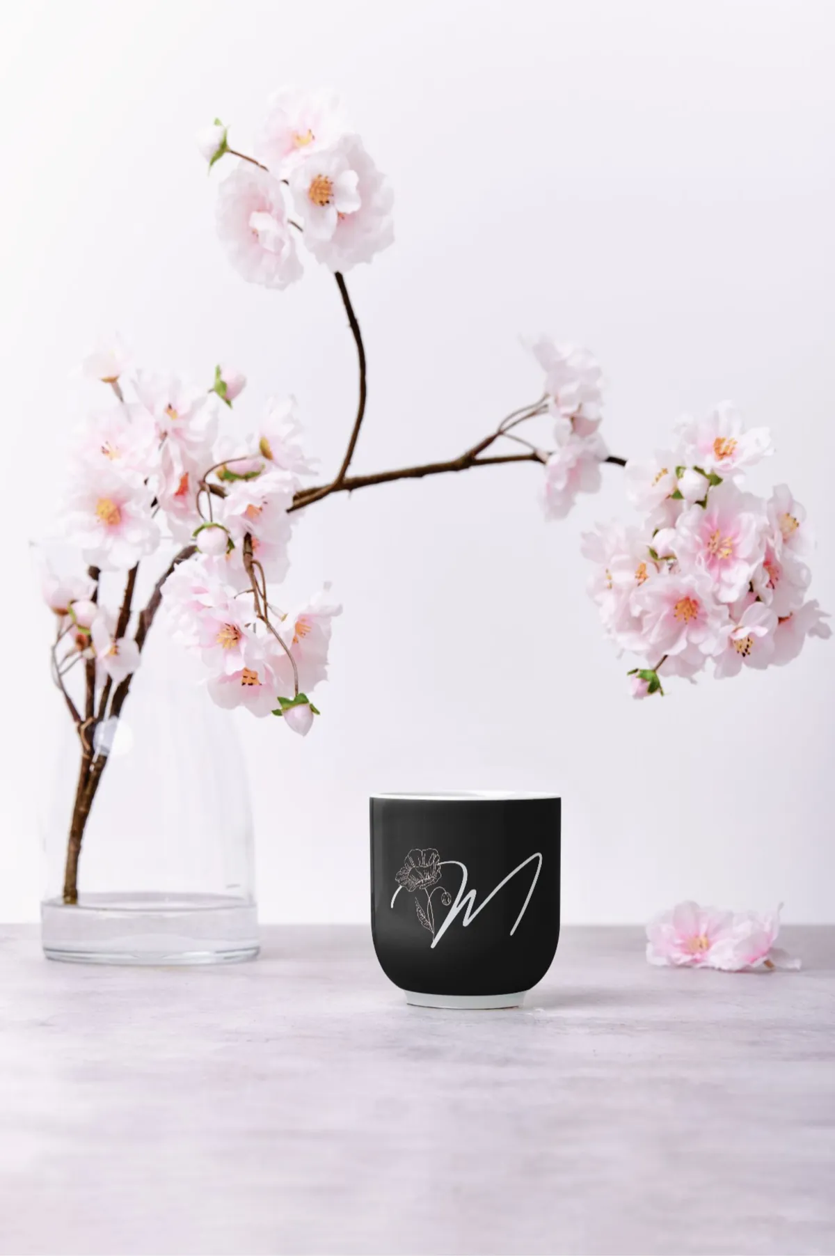
The identity was designed to translate seamlessly across every touchpoint, from custom packaging and branded merchandise to digital platforms and event collateral. A brand that shows up consistently, whether a client is holding it in their hands or discovering it online.
What Was Delivered
Every touchpoint, considered.
The project covered the full brand experience, from the logo system through to the website and print ready assets.
Maire Floral Design
A luxury brand identity built for a high end wedding florist, refined,
romantic, and intentional. Every visual decision made to reflect
the artistry behind each arrangement.
Industry
Luxury Wedding Floristry
role
Brand Designer
scope
Brand · Web · Print
the brief
Refined, romantic, intentional.
Maire Floral Design needed a brand that matched the quality and artistry of her work. The existing visual presence didn't reflect a luxury wedding market, it blended in rather than standing out. The goal was to build something timeless that would attract the right clients and communicate premium positioning from the first impression.
The challenge
A talented florist with no visual identity to match her calibre of work. The brand needed to feel luxury without feeling cold, romantic without feeling generic.
The approach
Soft blush tones, refined script typography, and delicate illustrative elements, designed to let the florals be the hero while the brand provides an elevated frame.
Brand Identity
A palette that lets the florals breathe.
The colour palette was built to feel warm and romantic without overpowering the product. Soft blush tones paired with deep neutrals create contrast while keeping the focus where it belongs, on the arrangements themselves.
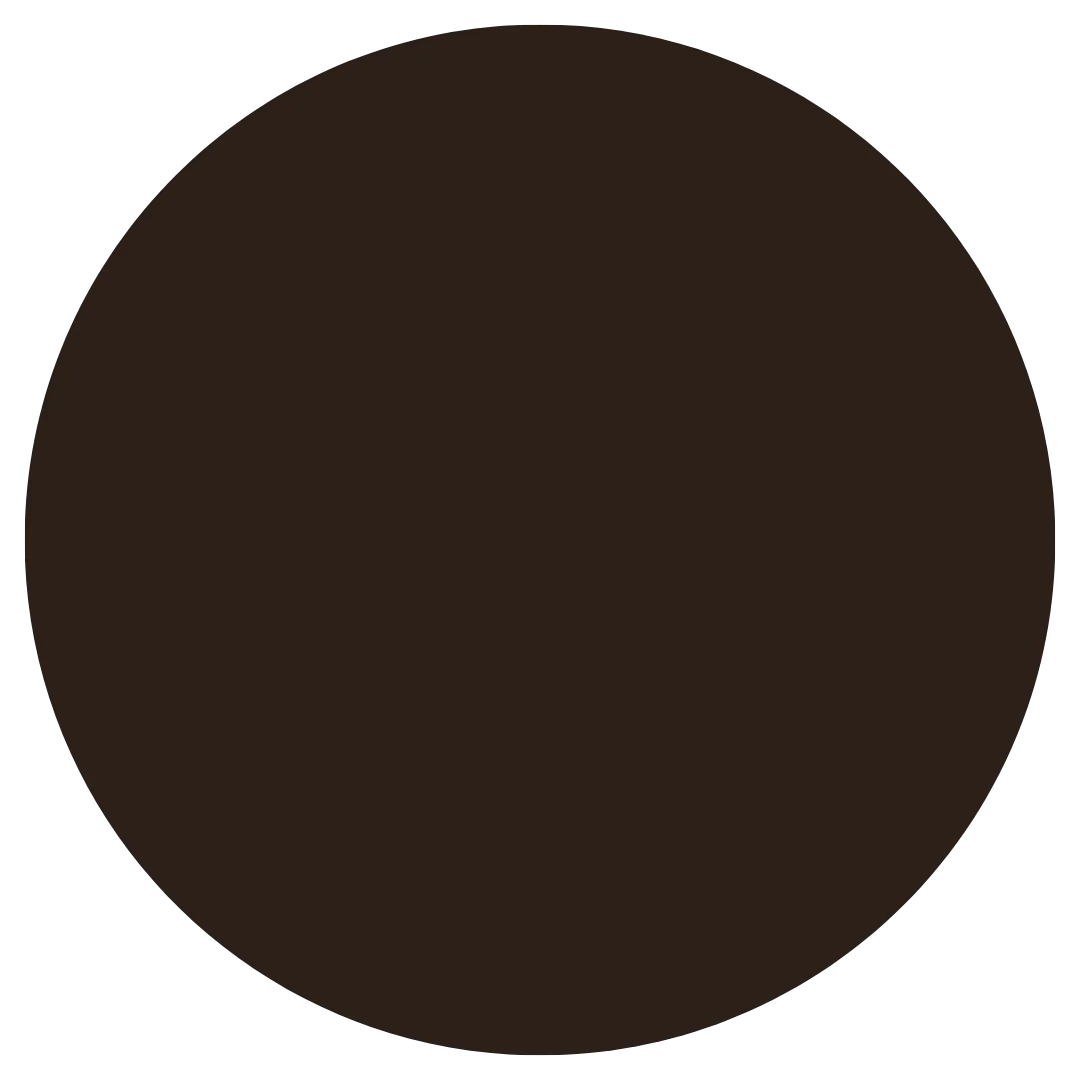
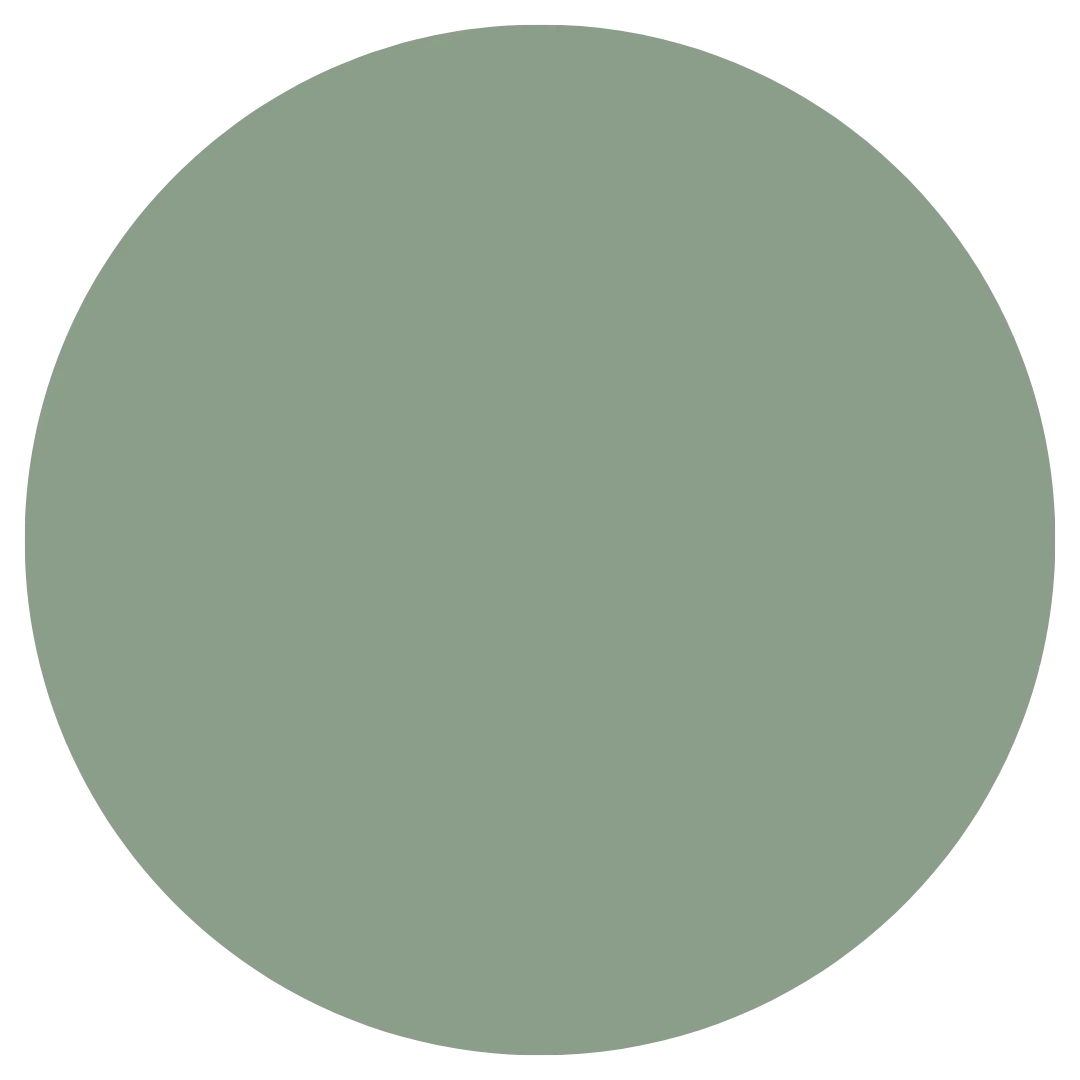
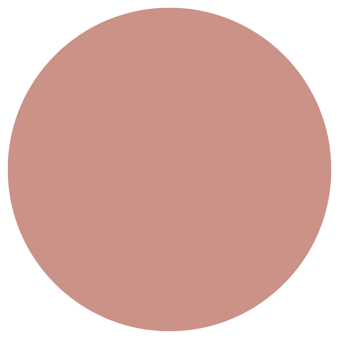
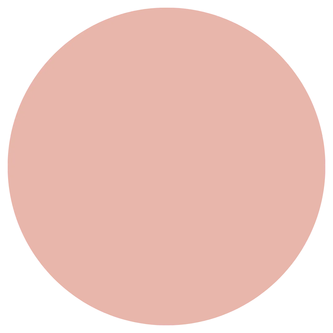
Brand palette and visual identity system
soft blush
#FBD5CE
rose blush
#E8B5AB
deep blush
#CB9287
sage
#8A9E8A
bark
#2B2018
Typography
Elegance with clarity.
Typography was chosen to balance personality with readability. A refined serif script carries the brand's romantic character across headlines and logos, while a clean supporting sans-serif ensures everything stays legible across both digital and print materials.
web design
The brand, extended online.
The website extends the identity seamlessly into the digital space. Large imagery, soft overlays, and restrained motion guide visitors through the work without distraction. The result is a site that feels immersive, polished, and aligned with the in person experience clients can expect.
Brand Applications
Built to live everywhere.
The identity was designed to translate seamlessly across every touchpoint, from custom packaging and branded merchandise to digital platforms and event collateral. A brand that shows up consistently, whether a client is holding it in their hands or discovering it online.
Let's build something like this for you.
Available for branding, websites, and marketing systems that help businesses grow with clarity and confidence.
What Was Delivered
Every touchpoint, considered.
The project covered the full brand experience, from the logo system through to the website and print ready assets.
Ready to elevate your brand?
Available for branding, websites, and marketing systems that
help businesses grow with clarity and confidence.

© 2026 Miya Ramos Studio
© 2026 Miya Ramos Studio
© 2026 Miya Ramos Studio