
Project Scoop
A bold, approachable brand identity built for a pet services company that
needed to stand out in a crowded local market, friendly enough to feel
personal, polished enough to scale.
Industry
Pet Services
role
Brand Designer
scope
Brand Identity · Visual Design · Marketing Assets
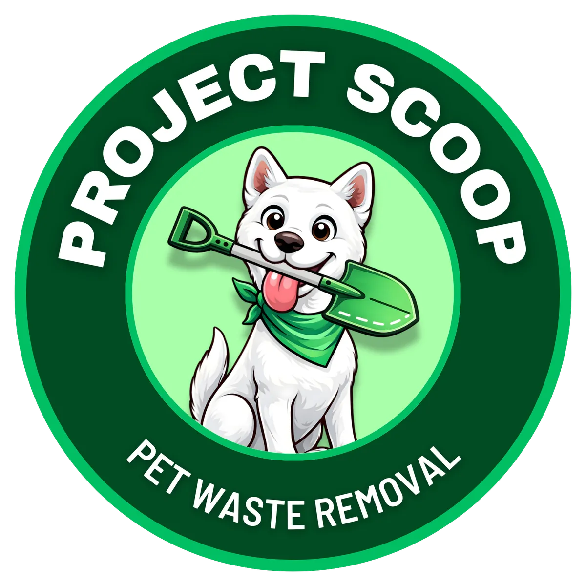
the brief
Playful personality. Professional finish.
Project Scoop needed a brand that felt friendly and approachable without sacrificing professionalism. The pet services space is crowded, most brands either look too corporate or too amateur. The goal was to land squarely in between: trustworthy, memorable, and distinctly local.
The final identity balances bold colour, custom illustration, and clean typography, built to scale seamlessly across uniforms, signage, vehicles, digital platforms, and marketing materials.
the challenge
Stand out in a saturated local market without looking generic. The brand needed to feel approachable and fun while still projecting the professionalism clients need to trust someone with their pet.
The approach
Bold green palette, custom dog illustration, and rounded typography, each decision made to feel local and warm while remaining clean enough to work across every touchpoint from social media to vehicle wraps.
Brand Identity
Bold where it counts. Clean everywhere else.
Three core design pillars drove every decision, colour, illustration, and typography. Each one chosen to serve a specific job in how the brand communicates.
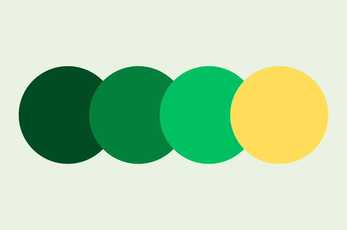
Colour Pallete
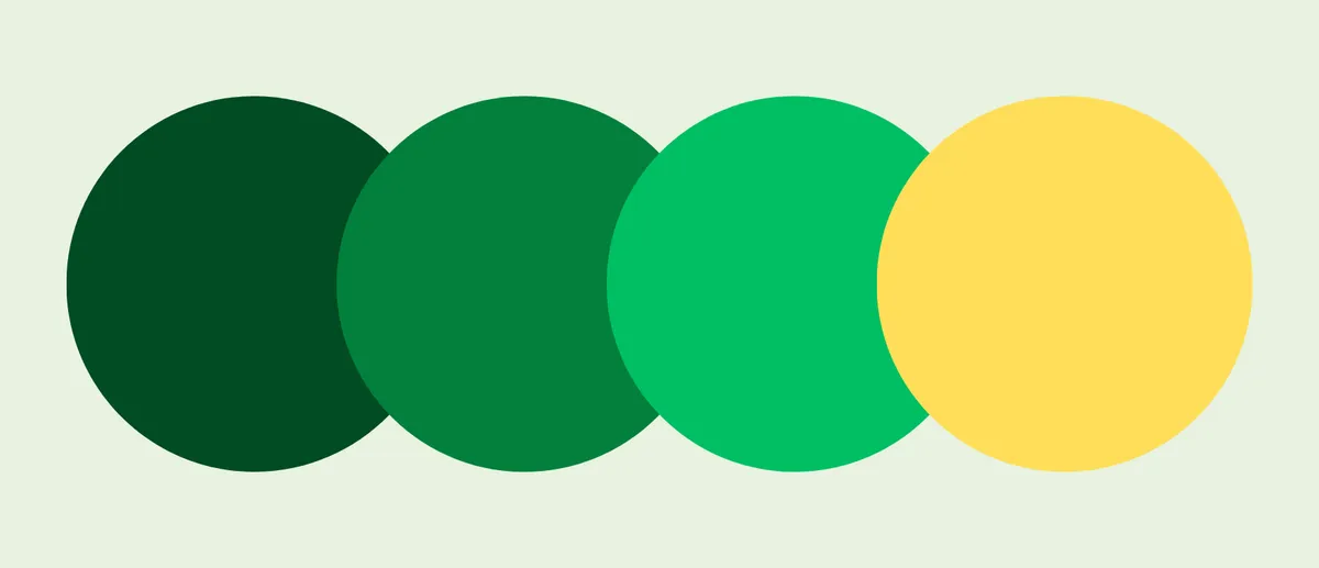
A bold green palette reinforces cleanliness, trust, and an immediate association with outdoor pet care.
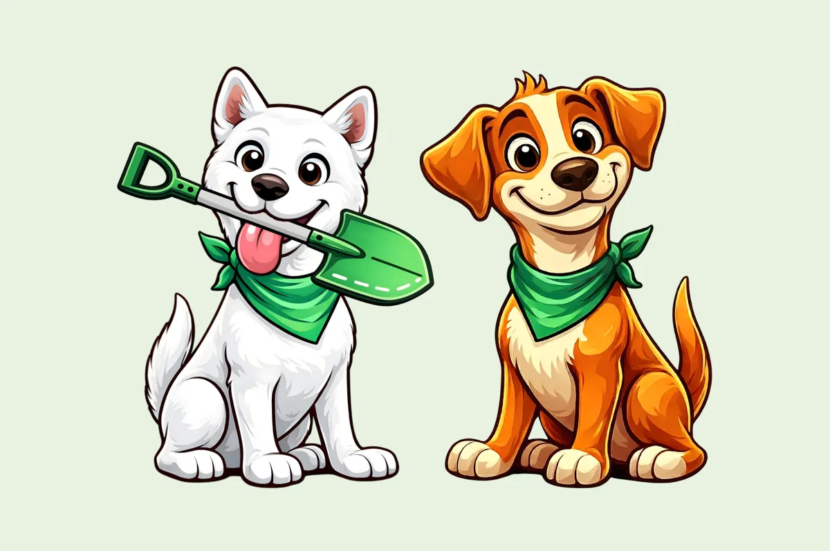
Illustration & Icon Style
A custom dog illustration adds personality and memorability, the brand feels friendly and local, not generic.
Typography & Layout
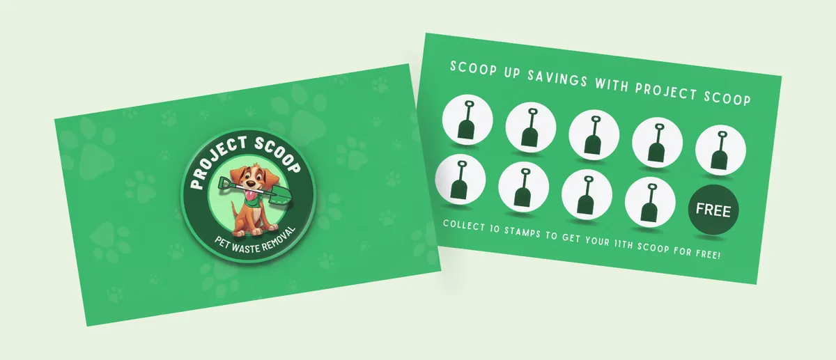
Rounded, legible type keeps the brand approachable while maintaining structure for signage, uniforms, and digital use.
colour system
Green that means something.
Every colour was chosen with intention. The greens anchor the brand in trust and nature, core values for a company working outdoors with people's pets. The yellow accent adds energy and makes the brand feel approachable rather than clinical.
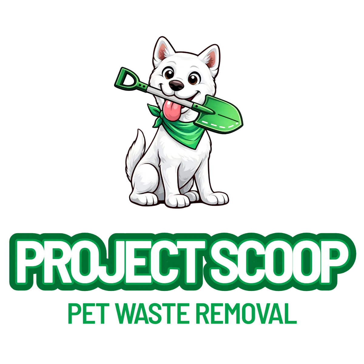
Primary and secondary logo
Leaf
#024b23
grass
#05803b
apple
#01bf63
sunshine
#ffde59
Brand Applications
Built to live everywhere.
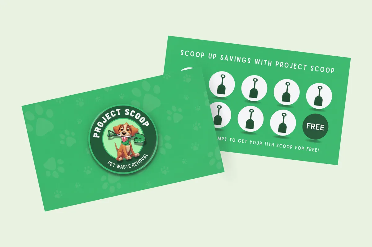
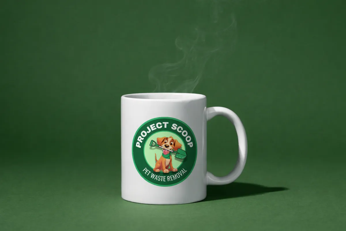
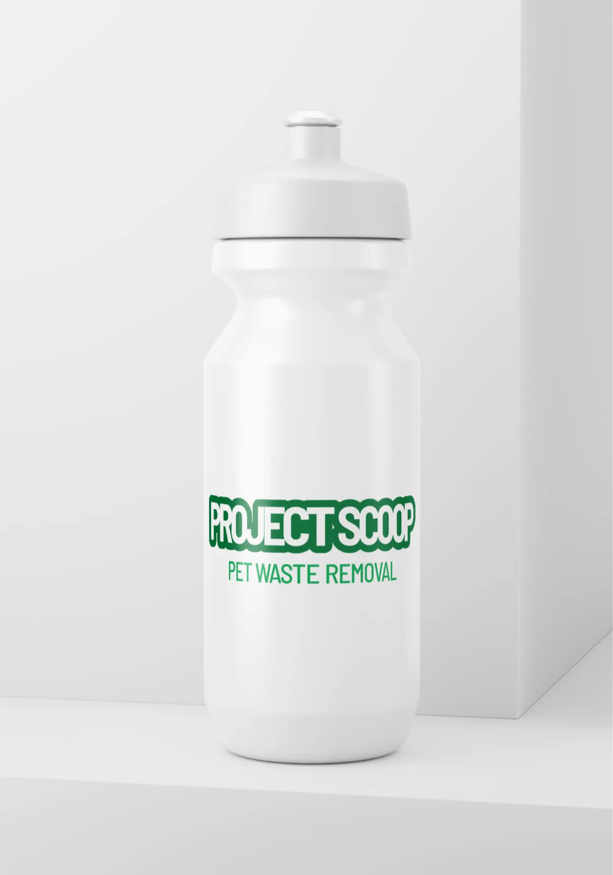
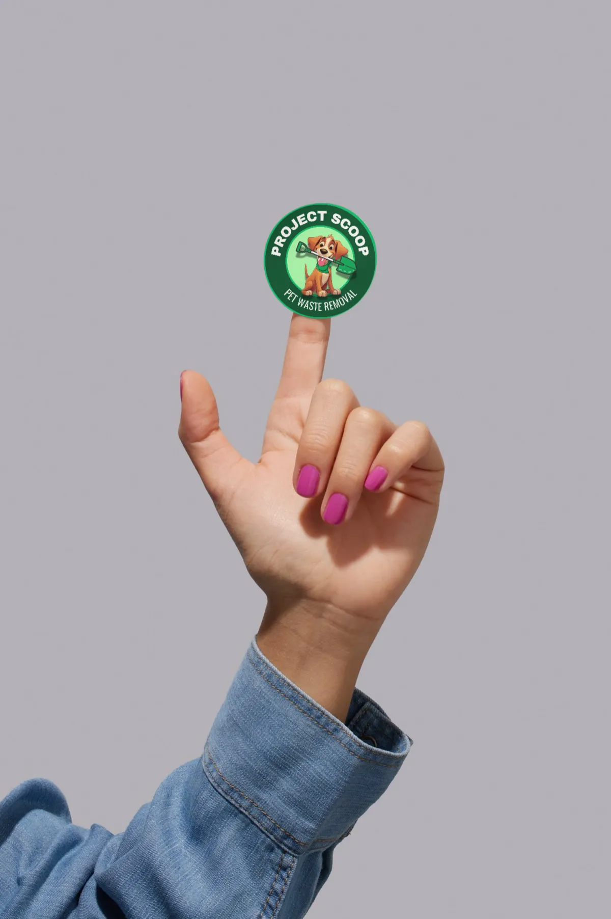
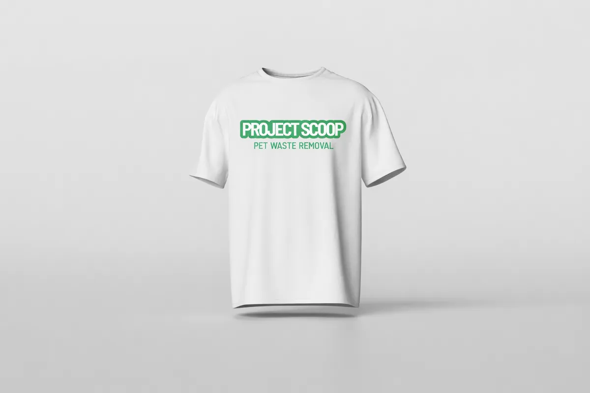
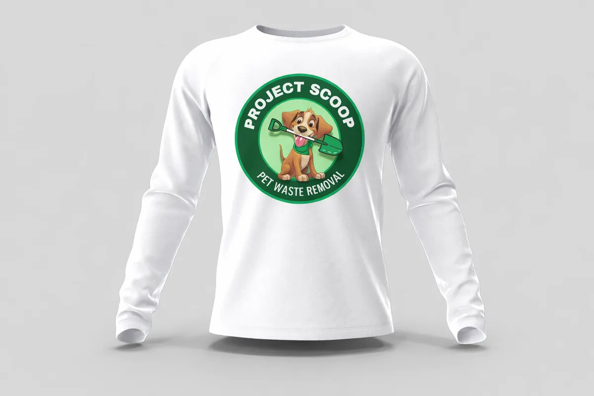
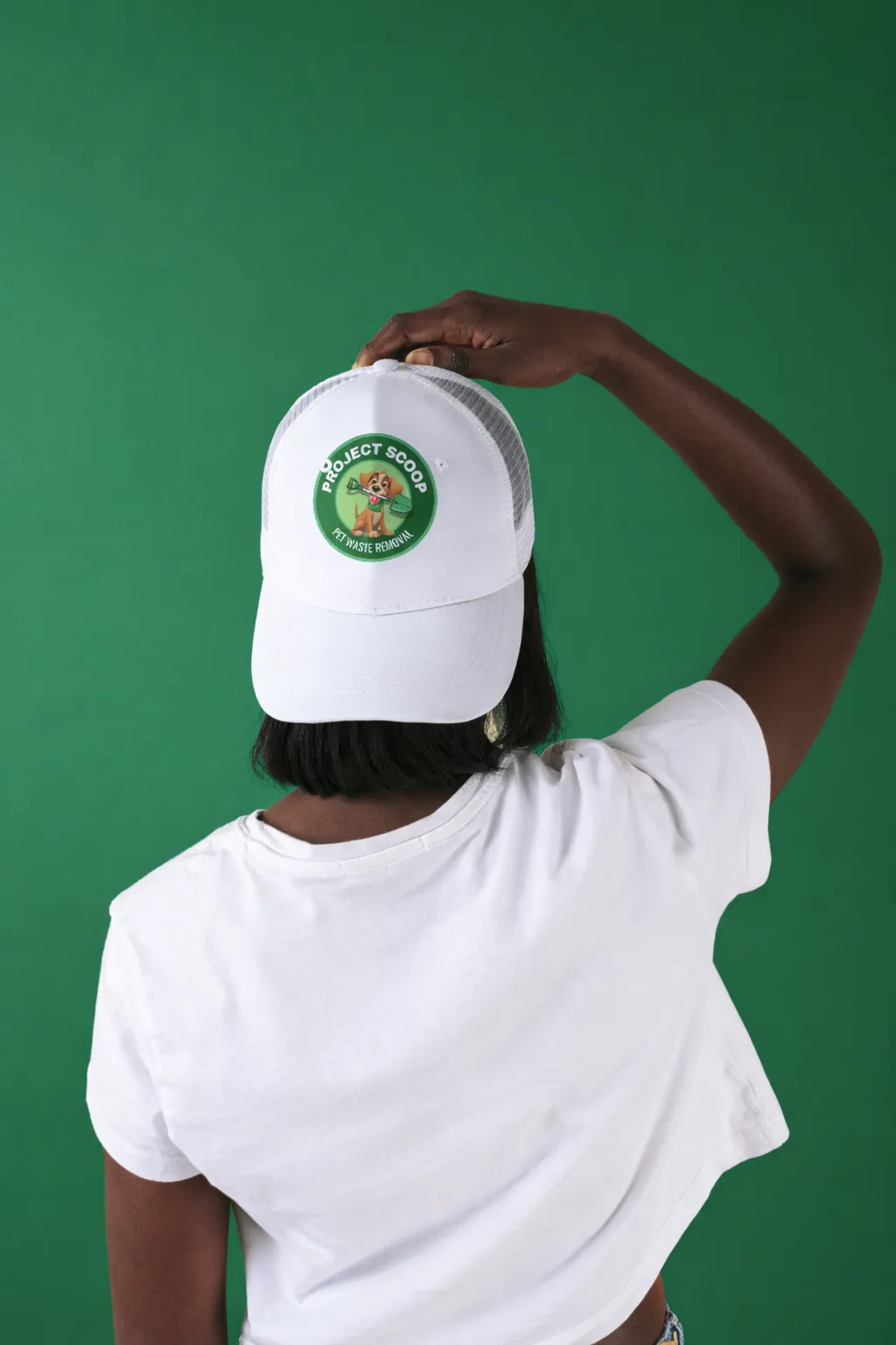
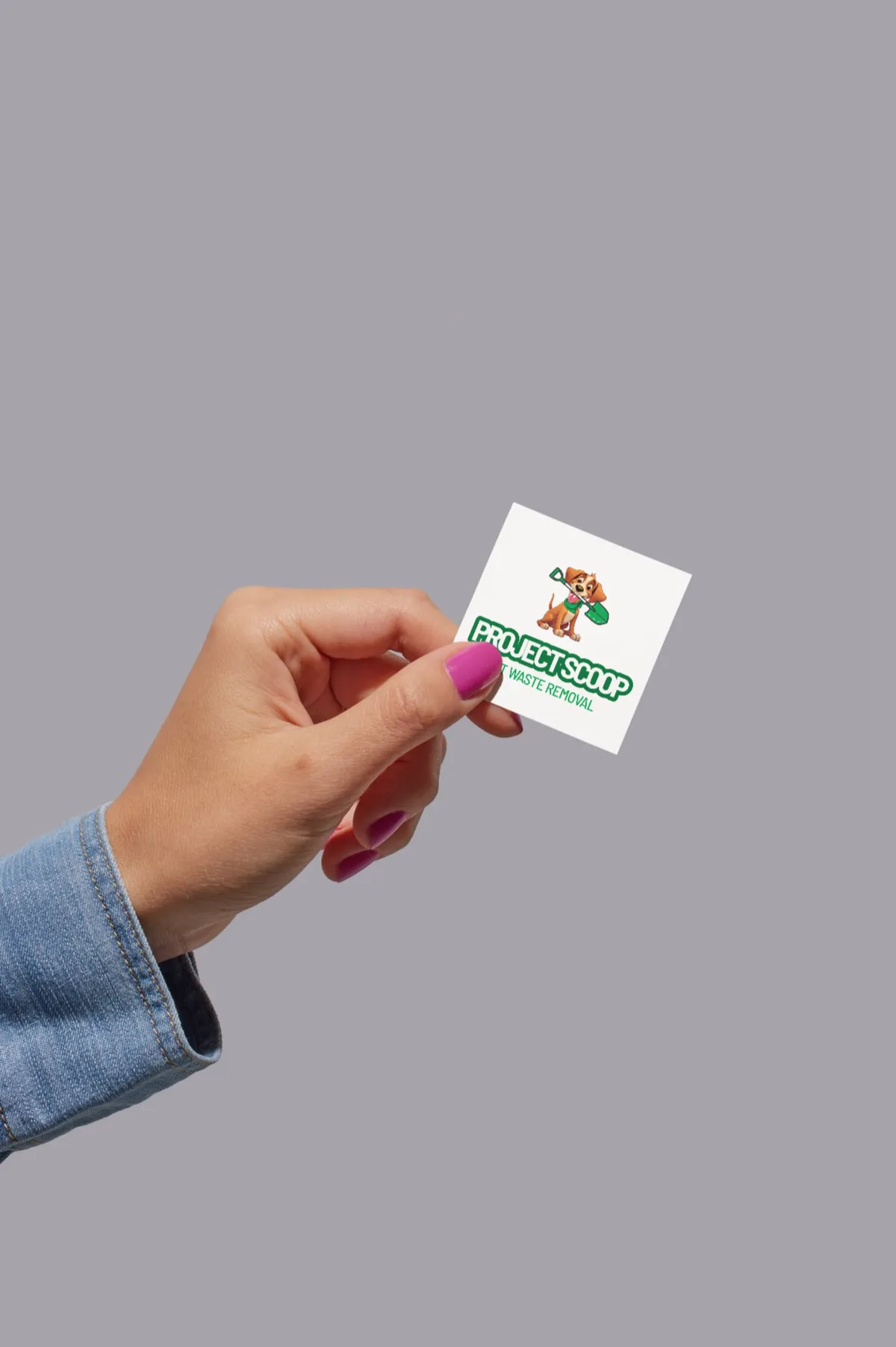
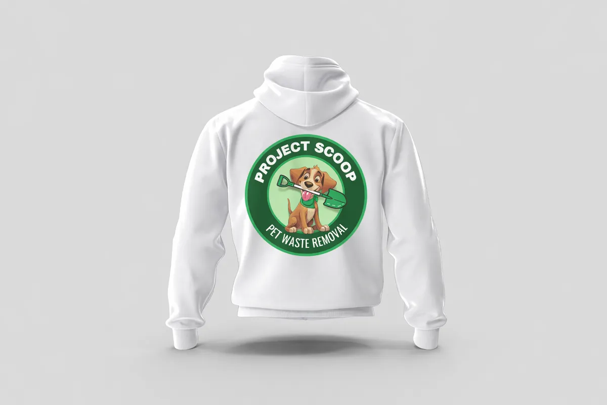
The identity was designed to translate seamlessly across every real-world touchpoint, from branded merchandise and uniforms to digital platforms and marketing materials. A brand that shows up consistently, whether a client sees it on a vehicle, a social post, or a business card.
What Was Delivered
Every asset, considered.
The project covered the complete brand identity system, from the logo through to print-ready and digital-ready
assets built to scale.
Ready to build a brand like this?
Available for branding, websites, and marketing systems that help businesses
grow with clarity and confidence.
Project Scoop
A bold, approachable brand identity built for a pet services company that needed to stand out in a crowded local market, friendly enough to feel personal, polished enough to scale.
Industry
Pet Services
role
Brand Designer
scope
Branding · Visual Design · Marketing
the brief
Playful and Professional.
Project Scoop needed a brand that felt friendly and approachable without sacrificing professionalism. The pet services space is crowded, most brands either look too corporate or too amateur. The goal was to land squarely in between: trustworthy, memorable, and distinctly local.
The final identity balances bold colour, custom illustration, and clean typography, built to scale seamlessly across uniforms, signage, vehicles, digital platforms, and marketing materials.
the challenge
Stand out in a saturated local market without looking generic. The brand needed to feel approachable and fun while still projecting the professionalism clients need to trust someone with their pet.
The approach
Bold green palette, custom dog illustration, and rounded typography, each decision made to feel local and warm while remaining clean enough to work across every touchpoint from social media to vehicle wraps.
Brand Identity
Bold where it counts.
Clean everywhere else.
Three core design pillars drove every decision, colour, illustration, and typography. Each one chosen to serve a specific job in how the brand communicates.
Colour Pallete
A bold green palette reinforces cleanliness, trust, and an immediate association with outdoor pet care.
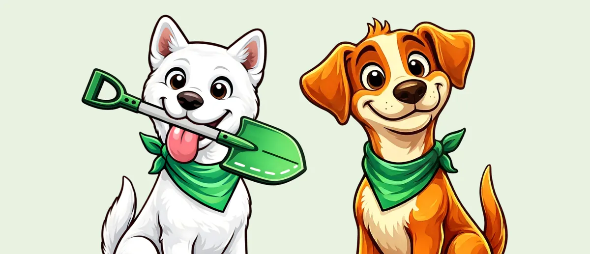
Illustration & Icon Style
A custom dog illustration adds personality and memorability, the brand feels friendly and local, not generic.
Typography & Layout
Rounded, legible type keeps the brand approachable while maintaining structure for signage, uniforms, and digital use.
colour system
Green that means something.
Every colour was chosen with intention. The greens anchor the brand in trust and nature, core values for a company working outdoors with people's pets. The yellow accent adds energy and makes the brand feel approachable rather than clinical.
Brand palette and visual identity system
leaf
#024b23
grass
#05803b
apple
#01bf63
sunshine
#ffde59
Brand Applications
Built to live everywhere.
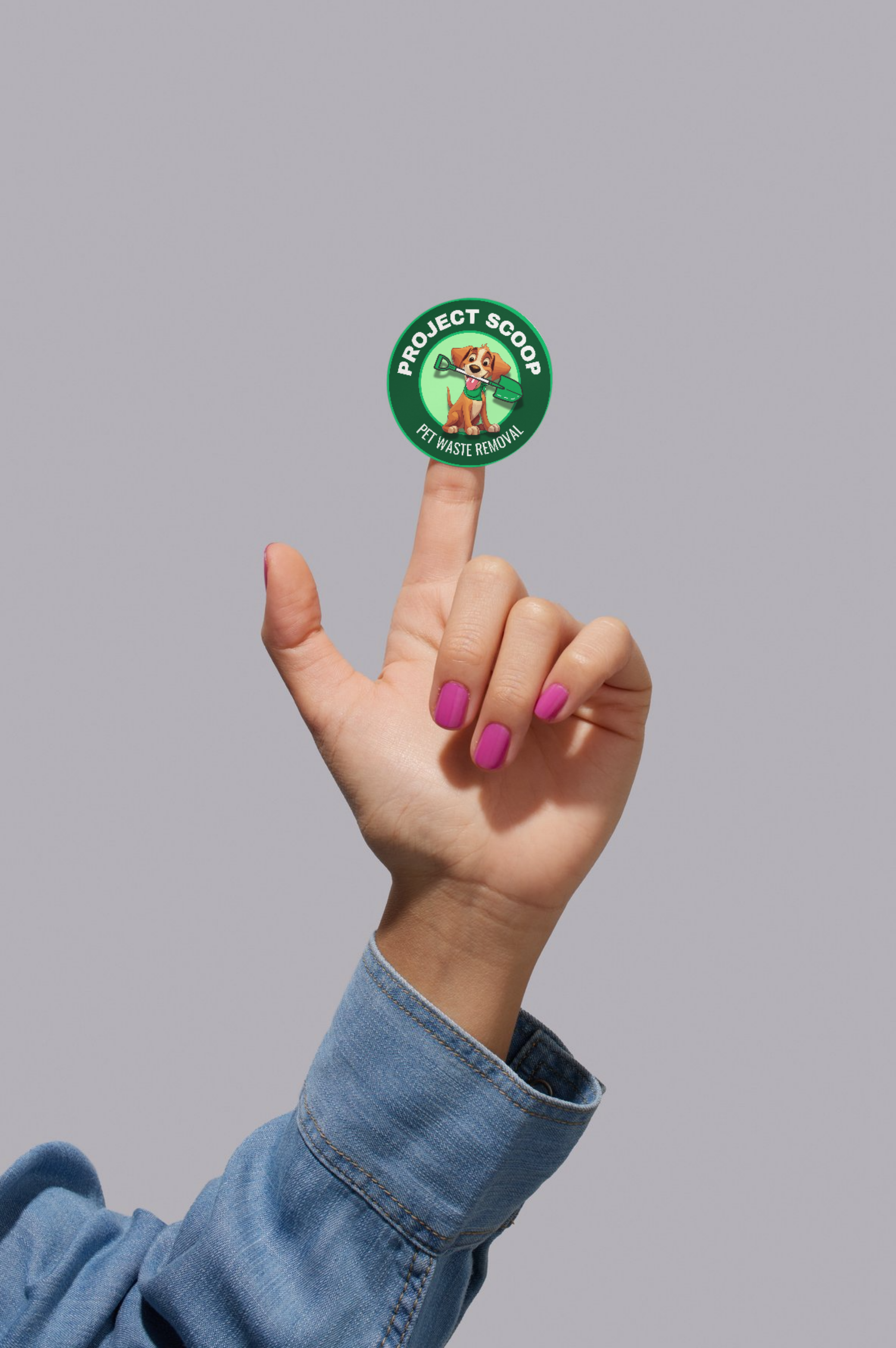
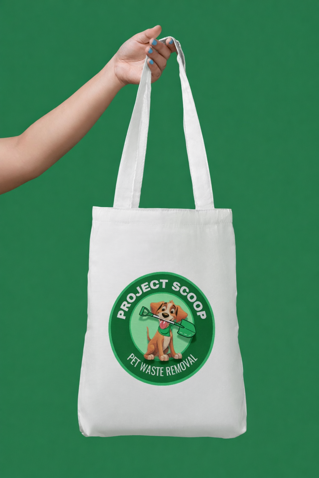
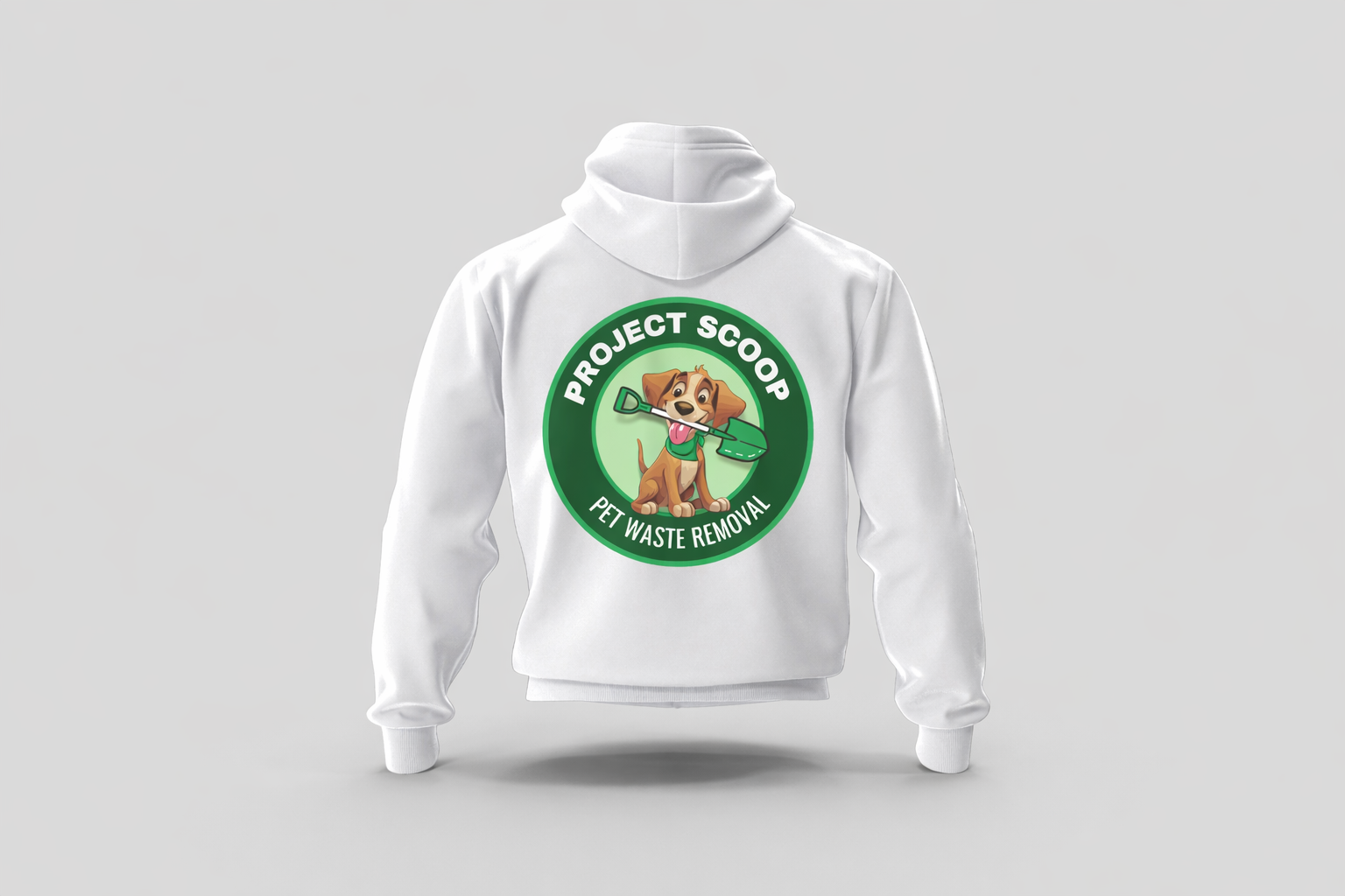
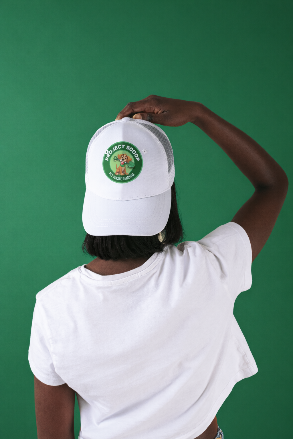
The identity was designed to translate seamlessly across every real-world touchpoint, from branded merchandise and uniforms to digital platforms and marketing materials. A brand that shows up consistently, whether a client sees it on a vehicle, a social post, or a business card.
What Was Delivered
Every asset, considered.
The project covered the complete brand identity system,
from the logo through to print-ready and digital-ready
assets built to scale.
Ready build a brand
like this.
Available for branding, websites, and marketing systems that help businesses grow with clarity and confidence.

© 2026 Miya Ramos Studio

© 2026 Miya Ramos Studio
© 2026 Miya Ramos Studio